黑白画来说印象最深的就是她的透视,很不寻常的取镜角度。牛逼的漫画家最喜欢画超难度的死角,标新立异的同时毫不掩饰的向你炫耀“怎样,你画不出来吧?”。采访中她说,她也没怎么练习,透视是天分,这更让人受刺激!
贴些资料和图上来。
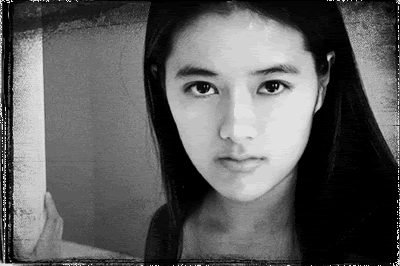
笔名:咎井淳
外号:G.P、饭桶
籍贯:浙江省诸暨县
学历:复兴商工毕业,目前在NORTHERN VIRGINIA COMMUNITY COLLEGE学习正统美术。
生日:7月4日
星座:巨蟹座
血型:容易紧张的A型
个性:少根筋、冒失、一着急就开始胡言乱语、乐天,但有时会为无聊的芝麻小事钻牛角尖、容易想入非非、喜欢倒胃口的话题
嗜好:听摇滚乐、弹吉他、看电影。
如何进入漫画界:同人志
首次发表处女作:《无聊剧场》、《维纳斯童话》(金星战记同人志)
最欣赏漫画家:安彦良和、多田由美
愿望:儿时想成为漫画家,现在想成为暴发户
最喜欢的运动:曾经喜欢篮球,现在偏好不动
最喜欢的音乐:CLASSIC ROCK(60-70年代)
最喜欢的歌星:NUNO BETTENCOURT
最欣赏的影星:艾尔柏西诺
影响最深的人:姐姐
最喜欢的颜色:黑、蓝
最喜欢的服饰:T-SHIRT、牛仔裤、靴子
主要作品:《镜子的另一边》
Links
- Official site of Jo Chen
- Jo's Wiki page
- Jo Chen's MySpace page
- Cover of the first issue
- Previewof the Robotech: Love and War miniseries
- Inteview with Jo Chen about XBOX FABLE game
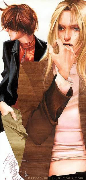
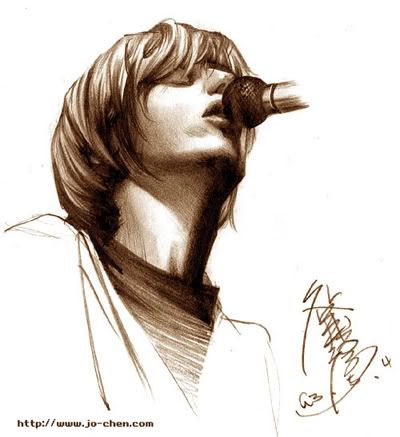
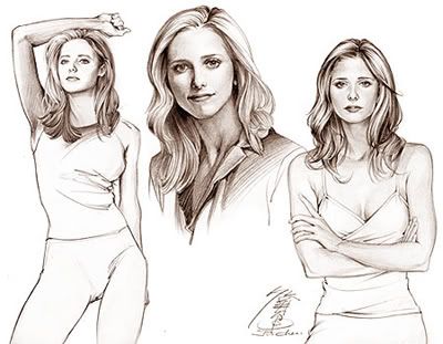
专访漫画家咎井淳 (摘录自东立星少女1998七月号)
颓废风吹袭漫画界,跳槽到商业志的同人漫画家咎井淳,刚出版的首作《镜子的另一边》,也采取颓废风,内容描述一对在纽约黑街相遇的落魄情侣,同病相怜的故事,画风充满冷冽的色彩。
亲眼见到咎井淳时,觉得她和这种超酷的风格完全不上线。长发及腰、身上还穿着件超人T恤的她,话匣子一开,遍劈哩叭啦的停不了口,丝毫不见作品里阴沉的气氛。怎么想到这么严肃的题材呢?咎井淳自称是:"为赋新词强说愁',耍酷而已。"
从国小便开始画画的咎井淳,国中便混进同人界,二十三岁的她,还是同人社团"秘密结社"的正式社员。"其实,我以前都画打杀搞笑的少年漫画,最喜欢的是安彦良和的《金星战记》、《亚利安》,《钢弹》之类少年漫画,即使中学时上了女校,没有女同学要鸟我的作品,我还是爱画。"连她也没想到,日后她竟然会以冷冽画风发表商业志。
从同人创作者跃上商业志,有何不同呢? "专业画家有稿压,我曾边哭边赶稿,虽然赶出来后心里会很爽,毕竟还是不一样。"因此咎井淳建议同人志玩家:"要恶搞就要彻底,能玩的时候尽量玩!"虽然被爸爸骂虚荣,她还是从美国搭飞机回来举行签名会,移民已有五年的她,和漫迷们面对面时,紧张的连名字都签错了,让签名会拖拉了超长的时间。
想看看镜子的另一边有什么吗?咎井淳邀你来分享一个同人画家的成长。
星少女专访
文:张正颖
上午11点,咎井淳踏着轻快的脚步迈进编辑部,穿着一件简单的深色上衣、一件LEVIS牛仔裤,背着一个小背包,提着一个大画袋,一头长发随着她走路时特殊的节奏微微飞扬,大大的眼珠闪着点点亮晶晶的光芒,对于这次访问似乎相当的兴奋,这样的"咎井淳"形象和小编的想象中那个画风透明冷冽,空间感十足的"咎井淳",几乎无法作同一个人想象。但从她闪亮眼神中暗藏着的沉稳中,似乎又隐约看到了"镜子的另一边"的影子。
小编:"咎井淳",我一直觉得你的名字很特殊,有什么特殊的意义吗?
咎井淳:哈哈,这个名字是翻字典凑出来的!!因为当时我相当喜欢上条淳士,所以那个"淳"就是上条淳士的"淳";而"咎"这个字......我很喜欢它,觉得这个字很美;至于"井"嘛......,因为当时不知道"咎"、"淳"这两个字该怎么连接,于是我姐姐说"就用‘井'字连接吧!"这就是我的比明"咎井淳"的由来。
小编:刚开始我还以为"咎井淳"是个日本人。
咎井淳:变成很像日本人的名字;我也是史料未及的。(哈、哈)其实,我父母是有"仇日情结"的。因为受到父母的影响,小时候还曾经发生过一件很糗的事!有一次姐姐在买"贝露莎"的卡通原声带(......记得这部卡通吗?),我还跪在地上大声哀求姐姐"不要做汉奸!"(哈、哈)搞的整家店的顾客全都再看我们,好糗喔!
小编:你姐姐对你的影响很深?
咎井淳:对。我喜欢漫画、会入这一行,都是受她的影响。对我来说,姐姐就像是个"启蒙灯塔"一样。小时候,我们就常常拿着一大张白纸,我坐一边、姐姐坐一边,先设计出几个人物;姐姐会先就其中几个角色安排他们之间的剧情、发展、对话,之后便轮我安排我手上角色的剧情、发展、对话,有点像"纸上即兴创作",这也是我创作的起源。
小编:姐姐是你的漫画导师?
咎井淳:其实不仅只漫画、连在生活上都受她的影响很深。今天能有这样的"咎井淳"她也是最大功臣。我和姐姐之间就像"光与影"(当然,我是影。)无论画漫画、买日本漫画杂志、加入同人志社团......,姐姐总是站在我的面前,为我披荆斩棘的开出一条光明大道。我认为,在创作的摸索过程中是需要被鼓励的,不能对一个初出的创作者太严苛,对我而言,姐姐就扮演了这样的角色,在我年纪小、绘画技巧还不好的时候,她总是一直在旁边鼓励我;让我有信心走到今天的地步。
小编:你现在的画风色彩相当类似多田由美,受她的影响很重?
咎井淳:嗯......我是个很容易受环境影响的人,喜欢的作品风格会很容易的表现在自己的作品里。国小的时候很喜欢安彦良和(金星战记、亚利安等等),当时的绘画风格就很"安彦",很少年;长大一点之后,因为姐姐的关系也喜欢上条淳士,大概有一年的时间,我的画风都受到他的影响,大约在同人志时代,当时读者还认为我的作品"线条很流利,可是人好丑!"!之后,又从ASUKA杂志上发现了多田由美,让我大为惊艳!!现在的作品视角、取景风格,受她的作品影响相当大。
小编:你创作的灵感从哪里来?
咎井淳:梦。(小编呈现呆滞状)真的!我觉得梦是属于每个人最独一无二的东西,在我的床边有一本"梦笔记",记录我作过的梦境,我的很多短篇的作品都是由我的梦境发展出来的。
小编:你的作品分镜相当流畅、空间透视相当立体,一般所谓的少女漫画风格中算是相当特殊,在这方面是特别受了谁的启发吗?
咎井淳:我的空间透视是一种直觉上的天份,并没有特别学习。但是以后会学习一些摄影方法,让自己的透视感更好。至于分镜方面......应该是受到电影的影响吧!
小编:你喜欢什么样的电影?
咎井淳:我喜欢充满异色、潮湿、古老气息、仿佛颓圮的街头死角般的电影。像"龙族战神"(李国豪主演)、the city of lost children等等。或者是黑色幽默的电影,像昆汀塔伦堤诺"黑色追缉令"或卢贝松的电影我都很喜欢。
小编:你喜欢的电影和你的作品感觉很像。
咎井淳:我很容易受环境影响。(哈)现在在美国我每天不是画漫画、看电影、就是看影集。有两个影集是我必看的:X档案和NYPD.blue。(此时小编的眼睛突然亮了起来,两个人开始讨论X档案的剧情,访问因此中断。)
小编:(咳、咳!)嗯......你喜欢的创作类型是什么?
咎井淳:我觉得一个创作者应该尝试不同类型的创作题材,再从中发现最适合自己的类型。像我之前比较擅长幽默搞笑的作品,在"龙少年"上的短篇"森林奇谭"就是一部那样的创作;或者是人生历炼还没到一个阶段,对于情感戏就完全不行,这篇"镜子的另一边"是我第一次尝试这样类型的作品。
小编:你当初创作这篇故事的动机是什么?为什么要叫这个名字?
咎井淳:这其实是我和表妹一同讨论出来的东西。因为之前大部分只画短篇作品,这是第一次尝试长篇的东西。或许是现在我的生活环境的文化冲突的影响吧,让我开始思考有关"认知"与"存在"的问题,所以才有这一篇作品。由"镜子的另一边"这个篇名就代表了这篇作品的主旨。我希望藉由一个性格晦暗的男主角,面对事情的态度,来讨论人类思想的价值观念。"幸"与"不幸"是一体两面,而镜子代表了所见世界的藩篱,一种人类价值观的认知。人的命运往往是自己造成的,遭遇事情的时候,男主角往往只看到"不幸"的那一面,并没有发现,只要跨过那面"镜子"
又能发现另一个世界。
小编:最后,和所有的读者说句话吧!
咎井淳:这篇"镜子的另一边"是我第一次尝试的类型,很多不成熟的地方希望大家多多包含,多多给予我鼓励,我会继续磨练画技、多多充实,会创作更好的作品让大家欣赏,请大家拭目以待!
Sketching a Fable - The Jo Chen Interview(Original article here)
Written By: Jewels
Posted: 05/25/2004
Photography: Photograph courtesy of Jo Chen, Box Art by Jo Chen and courtesy of Microsoft Game Studios


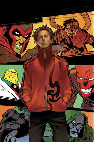
One of the most up-and-coming Manga and comic-book artists in the U.S. is Jo Chen. More recently known for her Racer X comic-series work, Jo had the opportunity to work on the packaging art for the highly anticipated Xbox game Fable, due out this summer. From publisher Microsoft Game Studios and developer Big Blue Box, Fable is one of the most hyped and long-awaited video game releases of 2004. The promotion story for the game states: “Fable is a ground-breaking role-playing adventure game from Peter Molyneux, in which your every action determines your skills, appearance, and reputation. Create your life story from childhood to death. Grow from an inexperienced adolescent into the most powerful being in the world. Choose the path of righteousness or dedicate your life to evil….” JIVE Magazine had the chance to discuss the new game’s box-art development with Jo and share how it differs creatively from any other type of comic-art project. You can find out more about Jo Chen and browse her galleries at www.jo-chen.com.
When did you first learn about the game Fable and how did the package-art project come about?
Todd Elhart of Hubris Studios contacted me in the spring of 2003 and pitched the idea. We had a couple of initial telephone conversations in which he described the game and what he had in mind for me. At first, he only wanted me to illustrate the packaging. But as the scope of the project expanded and became clearer, they asked me to do an Xbox Fable magazine cover and some promotional stuff like point-of-purchase art and in-store stand-ups. They even asked me to work with the British developers on the menu guts for the game itself, but that was too much for me to accept given my other commitments to D.C. and Marvel for cover work.
How did you develop your first ideas for the artwork? Were you given a prototype of the game to play or something else like storyboards? Also, how free were you to express your own creativity in terms of how the characters on the box looked?
The developers already had some pretty concrete ideas about how the characters should look. They sent me some pre-production art and some screen captures of the game itself to work from. The main illustration on the front of the packaging was undecided. The original idea for the package, I think, was to show the clean-cut protagonist dressed for war, with his arms folded in front of him. I honestly can't recall if they were already toying with the idea of the boy staring into rippling water and seeing a reflection or not. In the end, it was agreed that the most dramatic piece would be the wide-eyed, innocent boy starring at the reflection of the evil, leering adult. I did some rough work that was apparently well received and I remember participating in a nerve-wracking phone conference with the guys at Hubris, some designers in London (from Big Blue Box, I think), and some Microsoft personnel. I was so nervous and often I couldn't discern who was speaking or if they were addressing me. As a result, I often spoke out of turn, confusing everybody. In hindsight it was comical, but at the time it wasn't. I'm no good in those types of situations. Most of the time, the developers and Microsoft would relay their likes and dislikes of my work through Todd at Hubris, who would then convey them to me, whereupon I would modify the paintings accordingly. For the most part, I had a free hand rendering the established characters in my style. Conversely, I was constrained by some design concepts that had already been approved before I came aboard, such as armor and weaponry. Mainly, it was my style of drawing people that they were after.
What are some of the things or styles of the characters you would have changed if you were free to do so?
If I had had complete freedom and creative control, I probably would have changed some things. The current packaging's focal point is the little boy, despite the antagonist's presence in the murky reflection of the water. I might have made the villain the locus of the piece. In fact, I did one sketch of the metamorphosis of the main character in which each incarnation is breaking through the shell of the previous incarnation, something like a moth breaking through the shell of its cocoon, only several iterations occurring in the same illustration, depicting spiritual and physical devolution. But this is all just personal preference. In fact, the final painting I did that appears on the box, we all agree, captures the spirit of Fable very well.
Do you enjoy creating characters or drawing existing characters more? Which is more difficult for you?
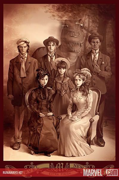
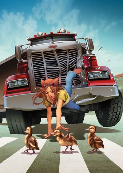
Of course I thoroughly enjoy putting my mark on existing characters like those in Fable and Batman and Robin, etc., but I love and live for creating my own characters and my own stories. And although it's much harder, it's extremely rewarding. I've been so busy painting for other publishers that I've let my own stuff languish, which I regret. But all that regret goes sailing out the window and is forgotten when somebody approaches me and tells me how much they like my work on Fable or The Runways or Street Fighter. It makes me so happy to hear that my art is appreciated and it keeps me out of the emotional troughs. I've come to the conclusion that I need to work on a mixture of existing characters and my own. Professionally, it's a nice, healthy balance.
What is your typical process of creating such an art piece and what type of technology do you use?
First, I usually create multiple rough—very rough—thumbnails from which I or my editor can choose. I hate drawing something infinitely detailed and then having to return to it over and over again to modify it as suggestions are made. It's a lot of unnecessary work and slows down the entire process tremendously. From the thumbnail, I create a larger rough pencil and ensure proper perspective and dynamics. Then I sketch a detailed pencil, with sharp lines, which gets scanned into Photoshop, where I apply base colors. All of the actual painting (i.e., brush strokes) occurs in Painter. In fact, I keep both programs open simultaneously and toggle between them to work on a piece. Many people ask me how I create these images, thinking this is a filter or some effect in Photoshop or Painter. But the images really are paintings. I paint them exactly as I would paint in oils or acrylics. The brush strokes are real and done with my graphic stylus rather than a brush. Only the special effects, like neon, lightening, or auras, are done with software gimmickry. The biggest advantage of this process is that I'm not covered in dabs of colored paint, smelling of turpentine and linseed oil. On the other hand, the disadvantage is that there is no original physical canvas since it is a digital image. I can never really have a gallery exhibition of my work that isn't composed of prints.
After completion of your first draft of the work, how many iterations occurred due to input from the developers or publishers of Fable before it was finalized?
Quite a few. However, the modifications were usually small things: making the eyes wider, making the thumbs bigger, making the dagger sharper and more sinister, etc. By far, the most difficult piece of art for me was the rippling effect in the water. I wanted to keep the package illustration as a one layer file in the software, but the requirements dictated that different characters had to appear in the reflection of the water, beneath the boy, for different promotional purposes. In the end, the artists at Hubris lent a hand in manipulating the ripples after my various illustrations were applied. There was no simple way around the problem, and it was a bit of a headache, but challenges are always good.
What is the hardest thing about doing artwork for a video game as opposed to other types of projects? And likewise, what is the easiest?
The hardest thing about games is that because of the size of the investment, a greater number of people are involved and have a say in the final version of the art. You have to please everyone: the developers, the marketers, the distributors. That said, the easiest thing about working on a game are these same people. They are artists, too, after their own fashion and everybody has a hand in creating the product. With Fable, everybody couldn't have been nicer—Todd Elhart at Hubris, especially. He really gave me a free hand, or at least the pleasant illusion of a free hand, and for that I am grateful. I would love to work with him again. The creative process on the whole, at least for me, is pretty much the same with any type of product. With comic books, I usually deal with a single editor, or an assistant editor, who rarely contacts me, except to give deadlines or a few instructions as to the type of illustration they're looking for. With games, there is much more conferencing to brainstorm, to ensure that instructions are clear and that required modifications are being attended to. Oh yeah, and the pressure. On Fable, it wasn't overt, but I felt its presence. I imagine that everybody involved was acutely aware that a lot was riding upon the work of each of the project's participants. And you don't want to be the one who blows it for everyone by missing a deadline or doing a bad job.
Do you play video games, and if so, which ones?
I played them before when I was younger and less busy, but rarely play now. I realized how much time a person can spend playing, leaving time for little else, and I had a career to start! I enjoy watching other people play, though. Let's see, in the past I've played Tekken, Tenchu, Resident Evil, and Grand Theft Auto. I always get killed so quickly in these games and usually end up with a sore hand from pressing buttons so hard. Not good for a painter.
What are your current projects and what future projects are you excited about?
I am just finishing up my series of covers for Marvel's The Runways series; I'm working on the last one now. I am continuing to create covers for Udon Comics' Street Fighter series. Mostly, I've been taking a break and working on my own stuff and trying to update my Web site. I've done a few doujin for publication in Asia and I continue to work the kinks out of the story arc for my epic tale of Chinese mythology, tentatively titled “The Specter King.” It's been five years since I published anything substantial in Asia and people who bother to write me indicate that they would like something new from me. So, I am working hard to get “The Specter King” off the ground. It is my intention to publish this in multiple languages, including English.
What is the most inspirational piece of advice you could give to a budding artist who sees you as a true success story, especially for working in gaming, Manga, or traditional comic-book industries?
Practice, practice, practice! I've been drawing and refining my style since I was five or six years old, and I'm still not perfectly happy with it. That drives me to improve myself through constant practice. This is my pragmatic advice to the budding artist. Also, study to be an artist and not just a comic-book or anime artist. The fundamental skills one learns in art classes will transfer into your work in the various popular industries like comics and video games. The work of the masters is far more valuable than any “How to Draw Manga” book ever will be. I refer constantly to the works of John Singer Sargent, Vermeer, and Georges De La Tour when I'm creating covers for comic-book and video game packaging. My second piece of advice is to get your work on the Internet. It seems pretty obvious but I don't know how many people I've met at cons who aspire to be working artists who don't have a site on the Web! I’m kind of stunned when I hear this. Honestly, it's the cheapest way to advertise in history. For $10 or less per year, you can secure a domain and build a full-color gallery site to showcase your work to millions of—scratch that—billions of people. And some of those people just might approach you with work; that's exactly how I got my first professional job in the U.S. Now, get pencilling and good luck!








No comments:
Post a Comment